5.3 Continuous Distributions
Continuous distributions are not restricted to having a finite or countable sample space and (depending on the distribution) can take any value on the real line. As above, we will not yet go into why the distributions are the way they are, only what they look like, and how to sample data from them.
For each distribution, we have the same four types of functions as discussed in the previous section.
5.3.1 The Normal Distribution
The normal distribution, also known as a Gaussian distribution, is a very important distribution in statistics (we will see why below). It is known for its iconic bell shape.
Random Samples
We can sample from the normal distribution using the rnorm() function. It takes three arguments:
n: how many data points we want to samplemean: the population (theoretic) meansd: the population (theoretic) standard deviation
rnorm(n = 5, mean = 5, sd = 2)## [1] 4.564656 7.496730 6.937214 5.514461 5.985538There is a special normal distribution called the standard normal which is simply a normal distribution with mean 0 and standard deviation 1. These are the default values of norm functions, so we can sample from the standard normal very easily.
rnorm(n = 5)## [1] 2.2130967 1.7633171 0.2901826 -1.3893091 2.1754976The normal distribution is a continuous distribution, so we shouldn’t visualize samples from it with a standard bar plot. (Why not?) Instead, a histogram will be more suitable.
samp <- rnorm(1000)
hist(samp, freq = FALSE,
     main = "Histogram of Normal data")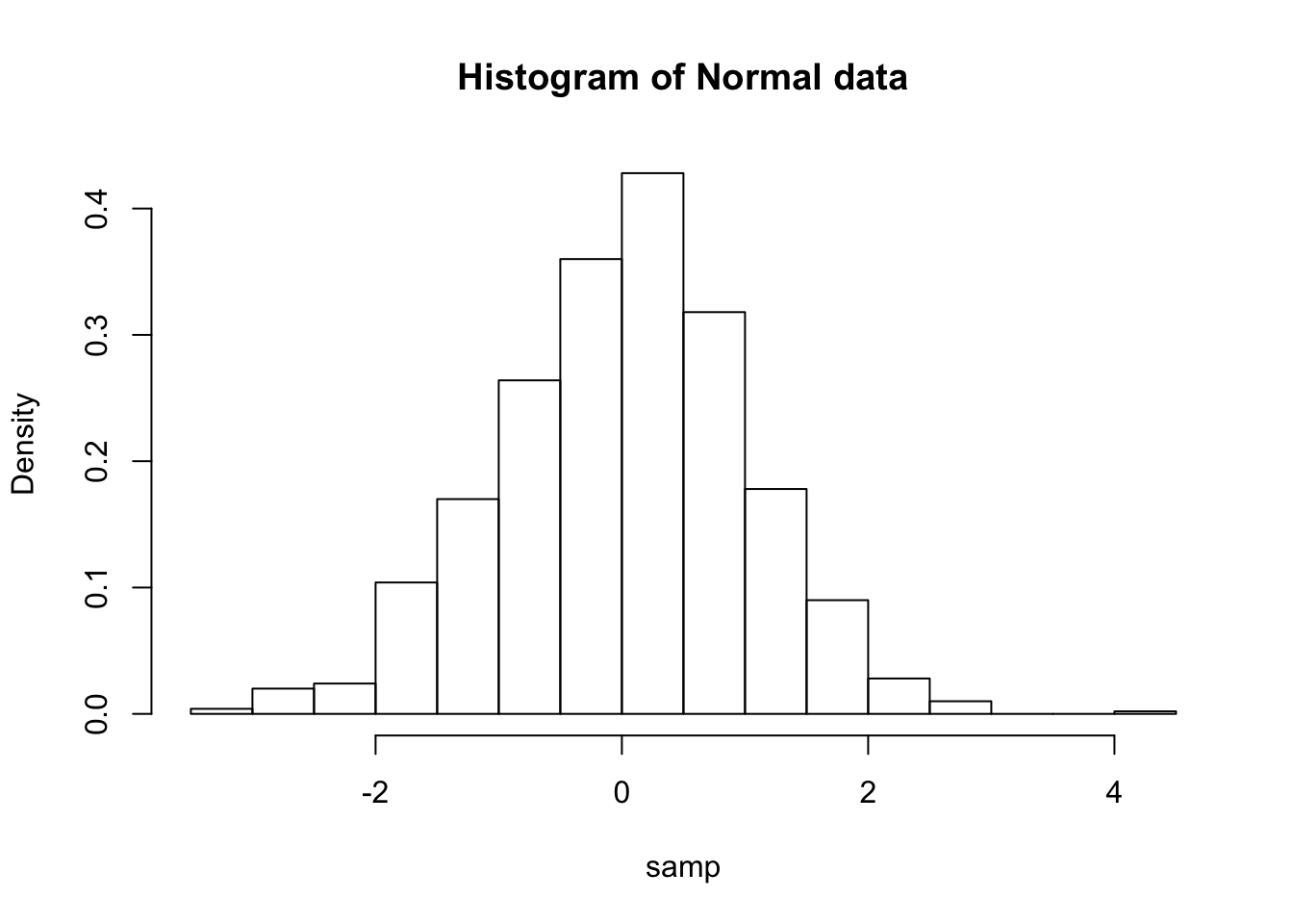
We can also plot an approximation to the continuous density based on our sample.
plot(density(samp),
     xlab = "x", ylab = "Density",
     main = "Approximate Distribution")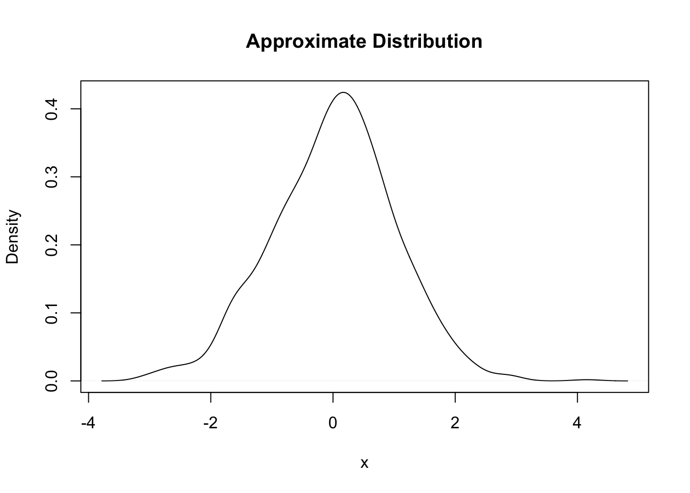
This approximation is achieved by choosing a “kernel” along with an appropriately sized bandwidth (similar to choosing the width of bars in a histogram). We won’t worry much about the details, but just know that different kernels and bandwidths will give different density approximations, so be aware of this, and try out some choices to see what differences you get (?density to see how to modify the default values).
Density Functions
If our sample had an infinite number of draws from the normal distribution, we would get an extremely smooth bell-shaped curve. It looks like this:
curve(dnorm(x),
      xlim = c(-3, 3),
      main = "The Standard Normal Distribution", ylab = "Density")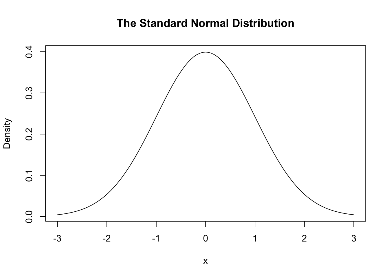
Here dnorm() is the density function of normal distribution. The curve() function is used to plot a smooth curve. It takes a function \(f\) as an input (here the normal PDF), computes the function values \(f(x)\) at numerous different \(x\) values selected from its domain, and then plots these \((x,f(x))\) pairs and connects them with line segments.
This distribution is always bell-shaped (it is sometimes called the normal curve). However the location and spread are determined by two parameters: The mean parameter (or \(\mu\)) specifies the center of the distribution, and the sd parameter (or \(\sigma\)) controls the spread (tall and narrow vs. wide and flatter).
curve(dnorm(x, mean = 2, sd = 0.5),
      xlim = c(-4, 4), col = "red",
      main = "The Normal Distribution", ylab = "Density")
curve(dnorm(x, mean = -1, sd = 1),
      add = TRUE,
      col = "blue")
text(x = c(-1, 2), y = c(0.2, 0.4),         # adds some text to the plot
     labels = c("N(-1, 1.0)", "N(2, 0.5)"),
     col = c("blue", "red"))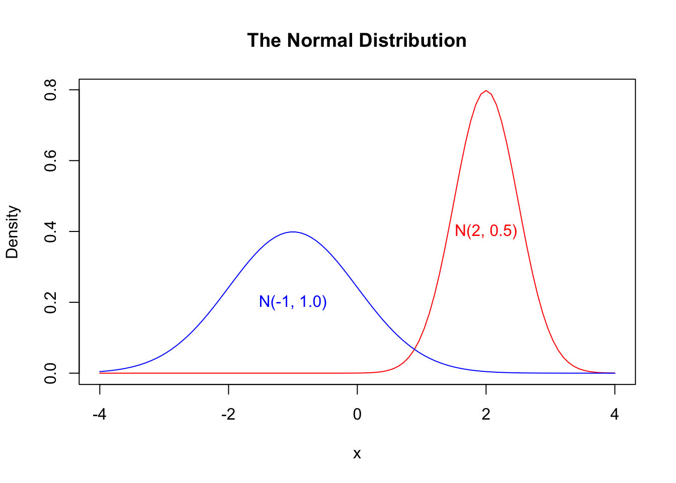
Cumulative Distribution Functions
The (standard) normal CDF looks like this,
curve(pnorm(x), xlim = c(-3, 3),
      main = "The Standard Normal CDF", ylab = "Probability")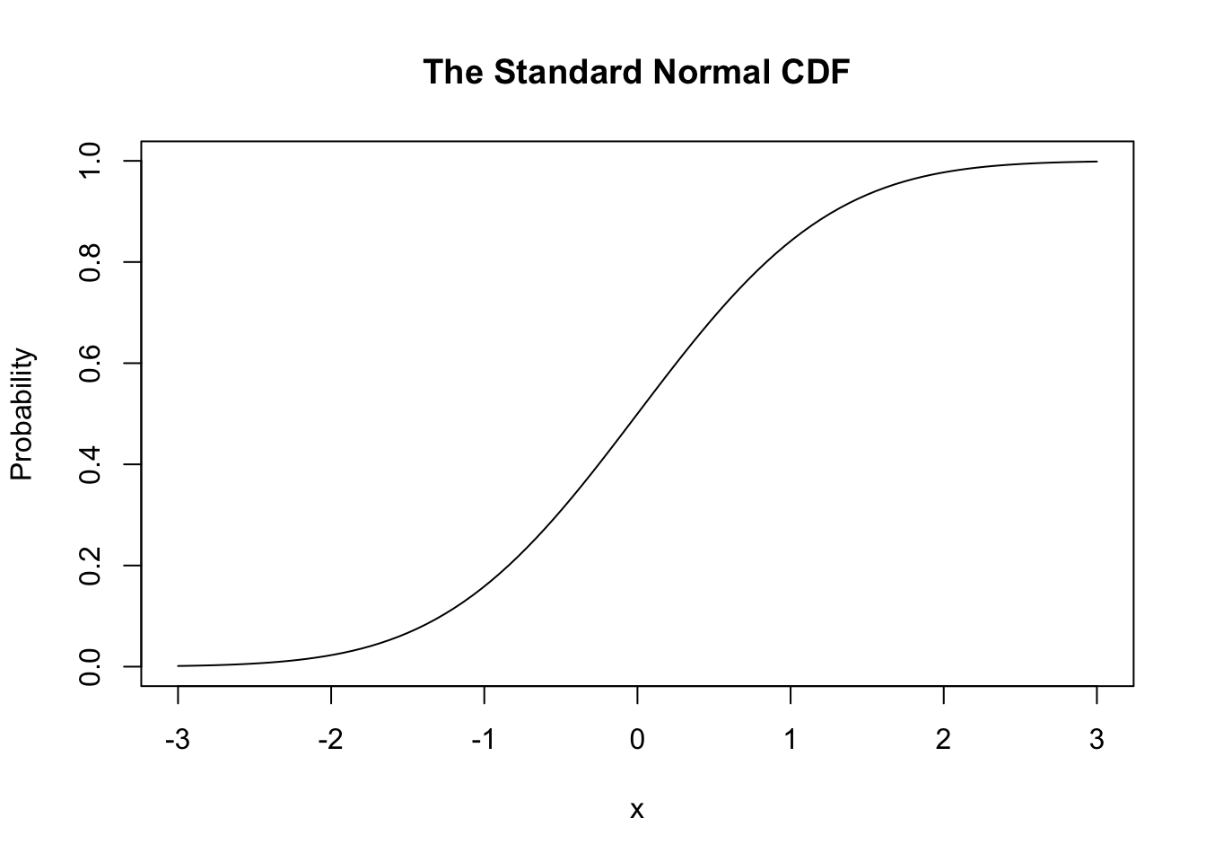
Normality
We can also check whether our data looks normal using a Q-Q plot.
qqnorm(samp, pch = 16,
       col = rgb(0, 0, 0, alpha = 0.5)) #transparent grey
qqline(samp,
       col = "red")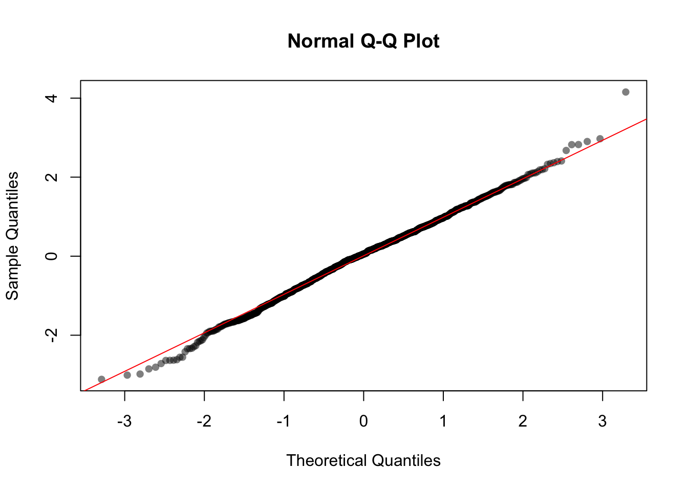
Here our data closely follows the ideal line, which confirms that our sampled data is approximately normally distributed.
5.3.2 The Exponential Distribution
Another very common continuous distribution is called the exponential distribution. We can sample from the exponential distribution using the rexp() function. It takes two arguments:
n: how many data points we want to samplerate: the rate that “successes” occur
rexp(n = 5, rate = 0.2)## [1] 2.060884 7.210729 4.326803 31.713820 2.143409Since the exponential distribution is continuous, we use a histogram to plot the data. We sample 10,000 data points from this rate = 0.2 exponential distribution:
data = rexp(n = 10000, rate = 0.2)
hist(data, main = "Histogram of Exp(rate = 0.2)")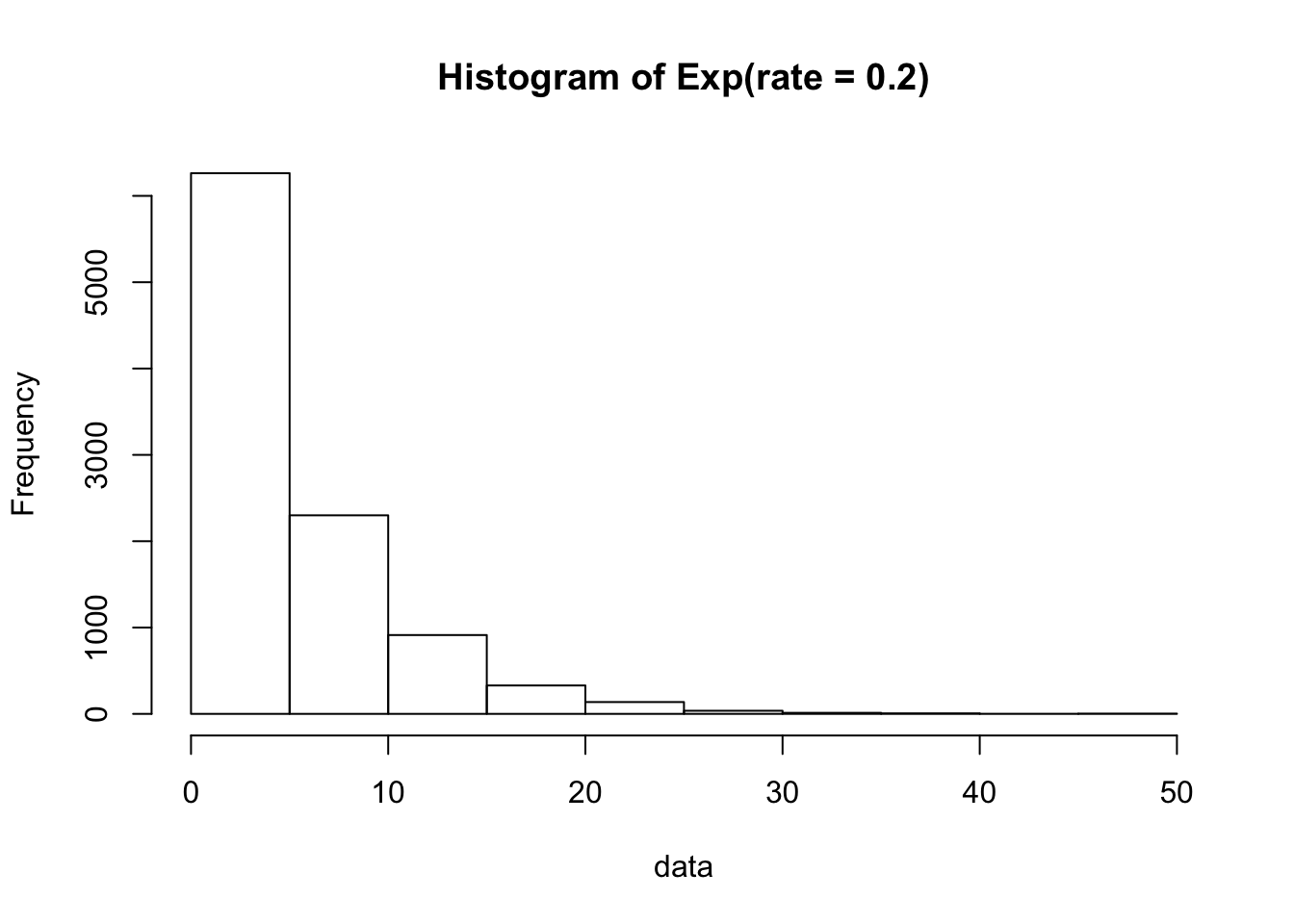
The exponential PDF can be plotted with:
curve(dexp(x, rate = 0.2),
      xlim = c(0, 50),
      main = "PDF of Exp(rate = 0.2)", ylab = "Density")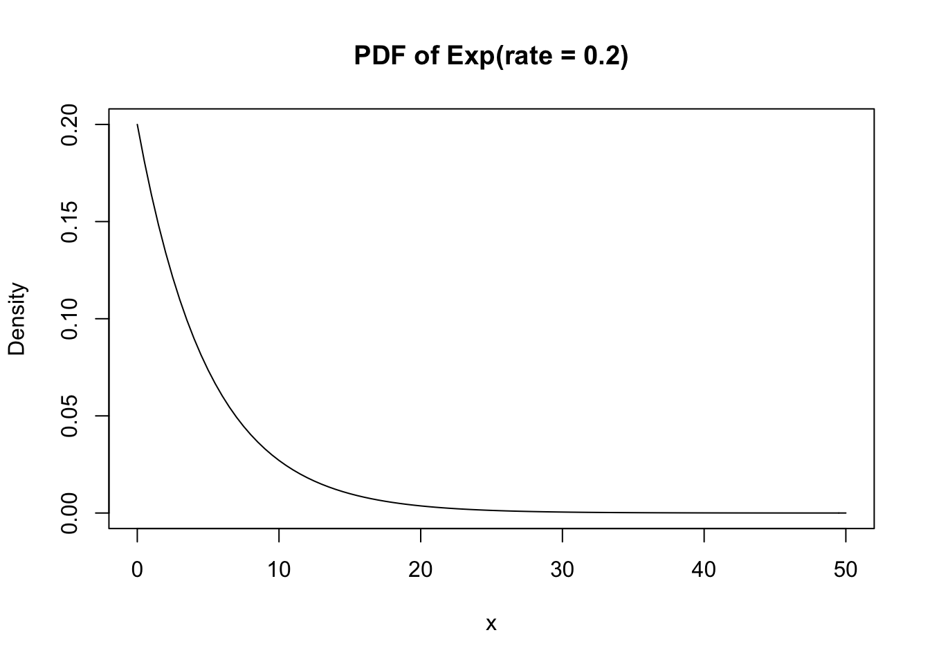
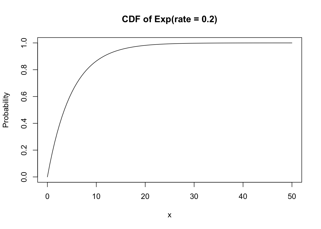
And the exponential CDF with:
curve(pexp(x, rate = 0.2),
      xlim = c(0, 50),
      main = "CDF of Exp(rate = 0.2)", ylab = "Probability")