Example Dataset: U.S. Democratic Votes by State
We’ll look at the trends over recent elections, using a dataset that records the proportion of Democratic votes by state (courtesy of Wikipedia). To refresh your memory:
- 2016 (Trump v. Clinton)
- 2012 (Obama v. Romney)
- 2008 (Obama v. McCain)
- 2004 (Bush v. Kerry)
These are named Y.2016, Y.2012, Y2008, Y2004 respectively in our data frame.
Download the file or copy the URL here: election04-16.csv. Either save the file to your working directory or paste the URL into the read_csv() function like below.
election <- readr::read_csv("https://uw-statistics.github.io/Stat311LabAssignments/data/election04-16_lab7.csv")
head(election)
## # A tibble: 6 x 6
## State ST Y.2004 Y.2008 Y.2012 Y.2016
## <chr> <chr> <dbl> <dbl> <dbl> <dbl>
## 1 Alabama AL 0.37 0.39 0.38 0.34
## 2 Alaska AK 0.36 0.38 0.41 0.37
## 3 Arizona AZ 0.44 0.45 0.44 0.45
## 4 Arkansas AR 0.45 0.39 0.37 0.34
## 5 California CA 0.54 0.61 0.6 0.61
## 6 Colorado CO 0.47 0.54 0.51 0.48Let’s take a quick look at our data. We’ve learned a number of different exploratory graphics for this, so let’s use a few here. First, a kernel density overlay to compare the univariate distributions of the Democratic voting fraction across states in the 4 elections.
library(DescTools)
PlotMultiDens(election[,3:6],
              xlab="Statewide % of votes for Democratic Candidate",
              main="Democratic Vote Share Distributions: 2004 - 2016")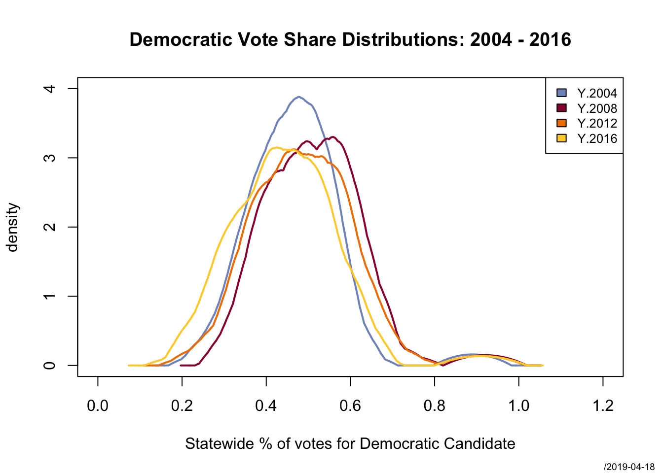
Running boxplots provide another good exploratory tool. We’ll use a version that allows us to easily identify the outliers.
library(reshape)
tmp <- melt(as.data.frame(election), # reshapes the data
            measure.vars = 3:6,      # using the last 4 columns
            variable_name = "Year",  # name for source column
            id.vars = "ST")          # keeping ST (state) for id
car::Boxplot(value~Year, data=tmp, col="lightblue",
             id=list(labels=tmp$ST, col="red"),
             main="Democratic Vote Share Distributions: 2004 - 2016")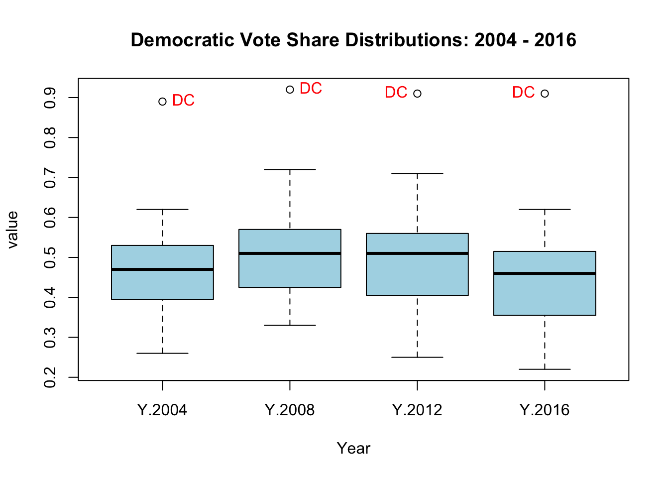
## [1] "DC" "DC" "DC" "DC"To compare how states changed across years (a bivariate metric), we can use a scatterplot matrix.
GGally::ggpairs(election, columns=3:6,
                title="Proportion of Democratic Votes by State")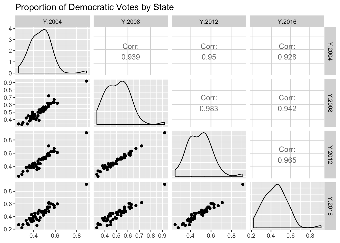
Discussion
- What can we see from the univariate distributions?
- How does the univariate distribution change over time? Is there evidence of polarization in the statewide voting patterns?
- Now viewing the joint distribution, does the pattern change much across the years? Note in particular 2008, 2012 compared to the other pairs – does this make sense?
- Also, be sure to note the x and y axis limits – are these the same for all the plots? Does that make it easier or harder to compare them?
For our analysis below, let’s see how the state voting patterns changed over the past two elections, 2012 and 2016.
plot(Y.2016~Y.2012, data=election,
                    main="Democratic vote shares: 2016 v 2012",
                    type="n")
text(Y.2016~Y.2012, data=election,
     labels=election$ST, cex=.7)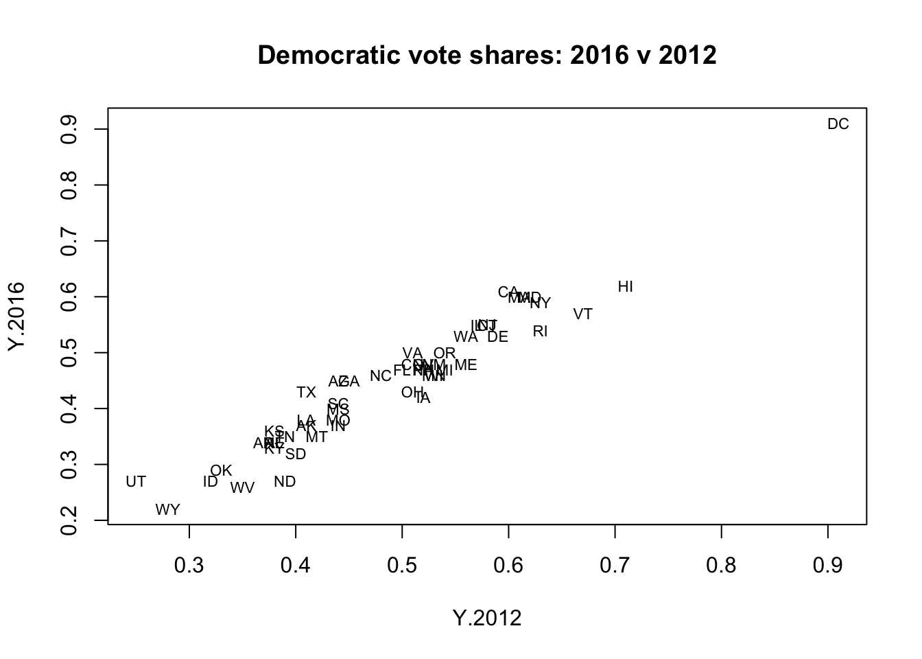
We will be using a simple bivariate linear regression model to predict how a state voted in 2016 based on how it voted in 2012. We can clearly see that DC is an outlier in the univariate distributions, but it seems to be consistent with trend observed in the joint distribution. Let’s hold it out to start, and then see how well our regression model, based on the rest of the states, predicts DC voted in 2016.
DC <- subset(election, State == "Washington DC")
election50 <- subset(election, State != "Washington DC")