5.4 Limit Theorems
5.4.1 The Law of Large Numbers
We can make a plot of the proportions of 500 coin flips with code like the following. Note the use of the cumsum() function, which calculates a cumulative sum that adds up the flips that are “H”. In the long run, we get “H” about half the time.
set.seed(1234)
flips <- sample(c("heads", "tails"), size = 500, replace = TRUE)
plot(cumsum(flips == "heads") / (1:length(flips)),
     type = "l", ylim = c(0,1),
     main = "Coin Flips",
     xlab = "Number of flips", ylab = "Proportion of heads")
abline(h = 0.5, col = "red")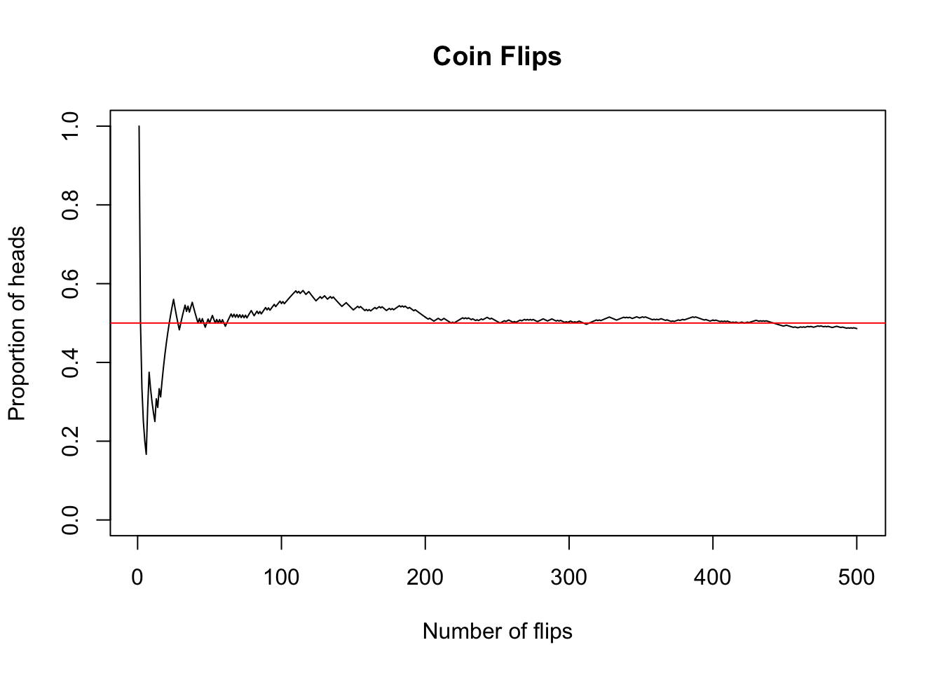
The theorem that guarantees this is called the Law of Large Numbers (LLN), a fundamental result proven by mathematician Jacob Bernoulli in 1713. The LLN is what allows casinos to make money in the long run, by guaranteeing that certain random variables have predictable distributions of values, at least in the long run.
Discussion
What does the Law of Large Numbers say about randomizing experiment subjects into treatment and control groups?
5.4.2 The Central Limit Theorem
Suppose we revisit the exponential distribution from Section 5.3.2. Let’s take three samples of different sizes, namely 10, 20 and 50.
set.seed(1727498)
e10 <- rexp(n = 10, rate = 0.2)
e20 <- rexp(n = 20, rate = 0.2)
e50 <- rexp(n = 50, rate = 0.2)
If we examine the samples, we can see how the behavior of an exponential distribution changes as the sample size increases:
par(mfrow = c(1, 3))  # plot one one page, in 3 columns)
hist(e10, xlim = c(0, 30),
     xlab = "x", main = "10 Exp(0.2) observations")
hist(e20, xlim = c(0, 30),
     xlab = "x", main = "20 Exp(0.2) observations")
hist(e50, xlim = c(0, 30),
     xlab = "x", main = "50 Exp(0.2) observations")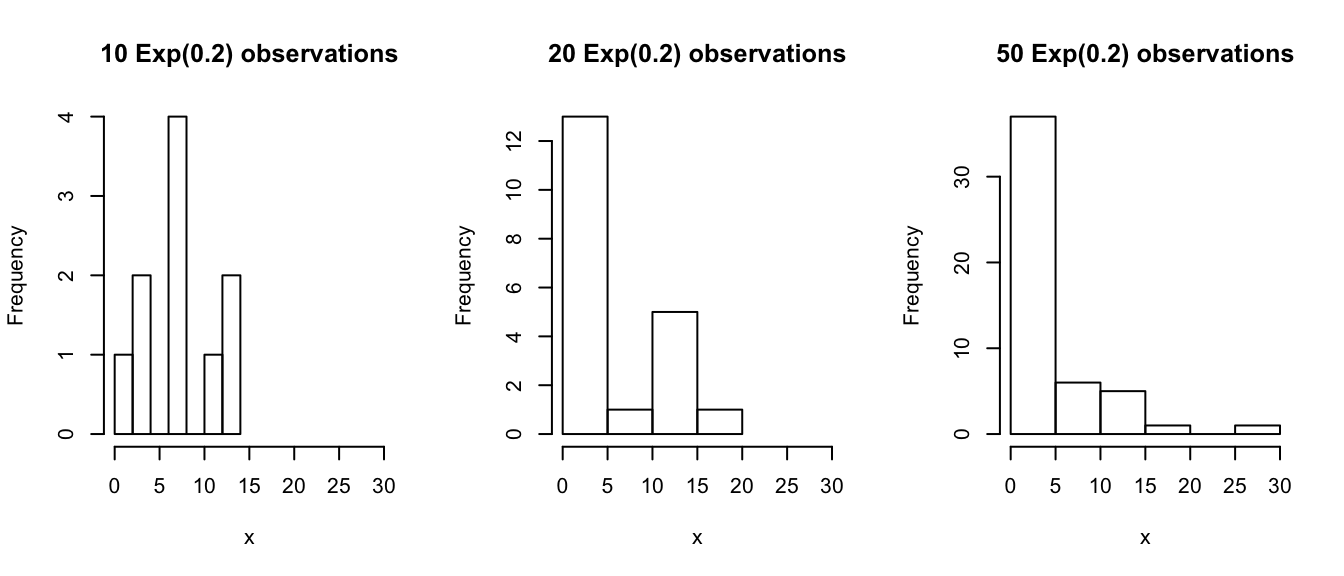
Now let’s see whether the data from each sample looks approximately normally distributed.
par(mfrow = c(1, 3))
qqnorm(e10, pch = 16, col = rgb(0, 0, 0, alpha = 0.5),
main = "Q-Q Plot: 10 Exp(0.2) observations")
qqline(e10, col = rgb(1, 0, 0, 0.6))
qqnorm(e20, pch = 16, col = rgb(0, 0, 0, alpha = 0.5),
main = "Q-Q Plot: 20 Exp(0.2) observations")
qqline(e20, col = rgb(1, 0, 0, 0.6))
qqnorm(e50, pch = 16, col = rgb(0, 0, 0, alpha = 0.5),
main = "Q-Q Plot: 50 Exp(0.2) observations")
qqline(e50, col = rgb(1, 0, 0, 0.6))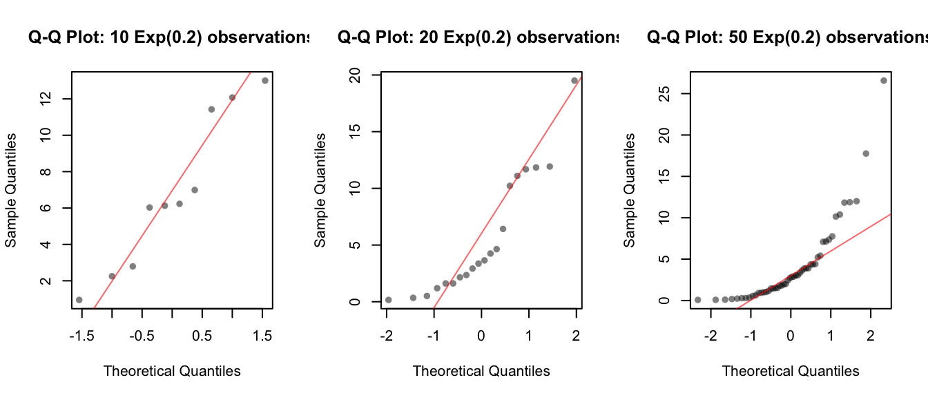 The smallest sample doesn’t give us much information, but as the sample size increases we can see definite departures from normality in the tails, which is characteristic of exponentially distributed data.
Next, let’s consider the means from each of these samples:
c(mean(e10), mean(e20), mean(e50))## [1] 6.787411 5.573423 4.214791These are the means of our particular samples. If we were to take another sample, we would probably get a different number for the sample mean. Try a new sample of size 10:
mean(rexp(n = 10, rate = 0.2))## [1] 2.243542Th value of the sample mean can be different every time we run the experiment, so the sample mean is a random variable too! It has a distribution, with a mean and a variance.
But … what is the distribution of the sample mean? Is it the same as the distribution of the original random variable? Or different?
To begin to answer this question, let’s investigate by simulating the distribution of the sample mean. To do this, we’ll need to draw repeated samples of the random variable, and calculate the mean for each sample. The replicate() function makes this easy. The resulting distribution is called “the sampling distribution of the sample mean”
set.seed(81793)
e10bar <- replicate(n = 1000, mean(rexp(n = 10, rate = 0.2)))
e20bar <- replicate(n = 1000, mean(rexp(n = 20, rate = 0.2)))
e50bar <- replicate(n = 1000, mean(rexp(n = 50, rate = 0.2)))
If we look at the histograms of the sampling distributions of the sample mean, we see the a bell-shaped curve.
par(mfrow = c(1, 3))
hist(e10bar, breaks = 10,
     xlab = "x", main = "1000 means from samples of size 10")
hist(e20bar, breaks = 10,
     xlab = "x", main = "1000 means from samples of size 20")
hist(e50bar, breaks = 10,
     xlab = "x", main = "1000 means from samples of size 50")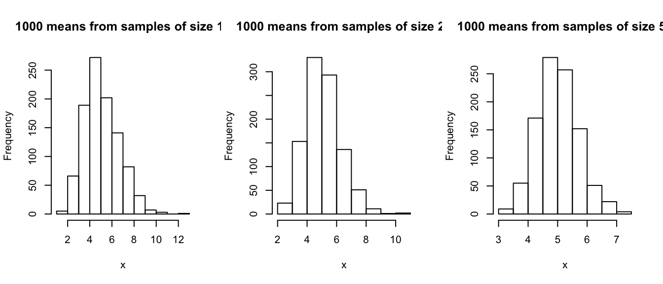
Is this a normal distribution? To answer that, we can use a Q-Q plot:
par(mfrow = c(1, 3))
qqnorm(e10bar, pch = 16, col = rgb(0, 0, 0, alpha = 0.5),
       main = "Sample size = 10",
       sub = "1000 repetitions")
qqline(e10bar, col = rgb(1, 0, 0, 0.6))
qqnorm(e20bar, pch = 16, col = rgb(0, 0, 0, alpha = 0.5),
       main = "Sample size = 20",
       sub = "1000 repetitions")
qqline(e20bar, col = rgb(1, 0, 0, 0.6))
qqnorm(e50bar, pch = 16, col = rgb(0, 0, 0, alpha = 0.5),
       main = "Sample size = 50",
       sub = "1000 repetitions")
qqline(e50bar, col = rgb(1, 0, 0, 0.6))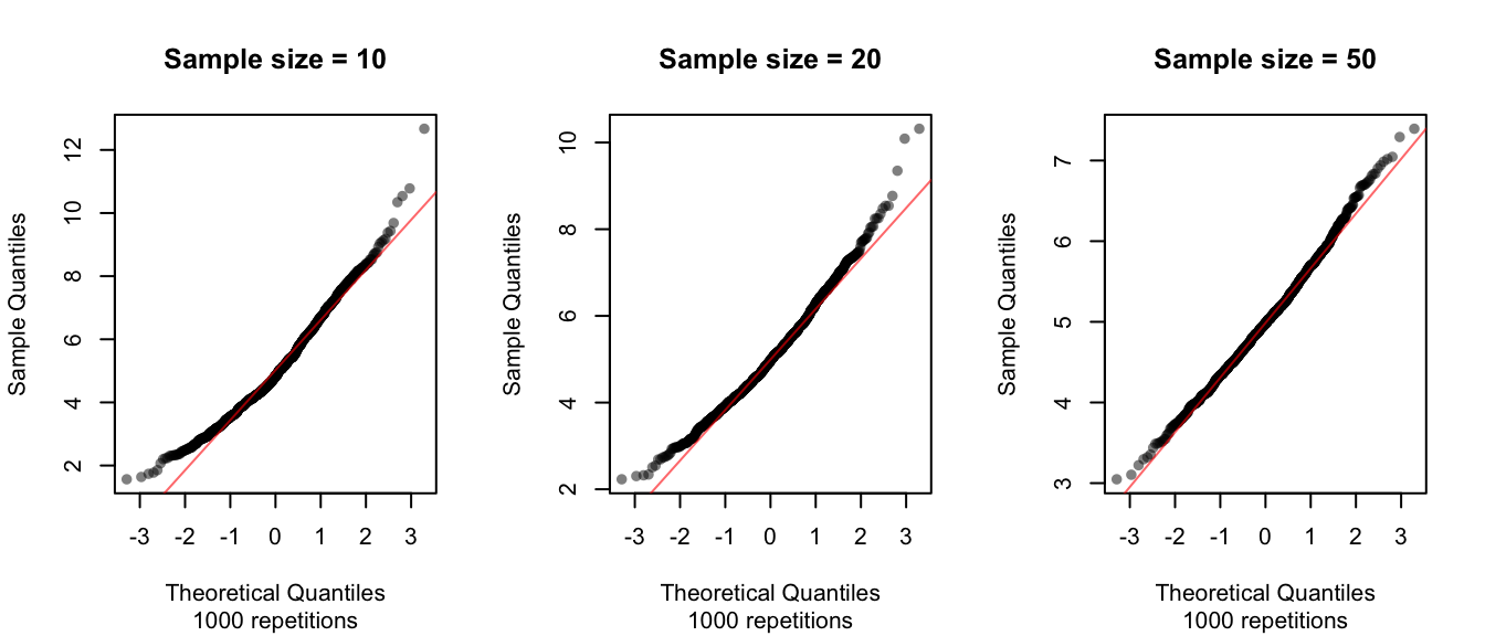
The sampling distribution of the sample mean appears relatively normal even with samples of size 10, but the approximation to normality improves improves substantially by the time the sample size increases to 50.
Note: the sample size here refers to the sample of the original random variable (10, 20 and 50), not the number of repititions (repititions = the number of means calculated from the repeated samples, which is the same in each case here: 1000).
This is no coincidence! We have a powerful theorem that shows that this is practically guaranteed to happen for the exponential and many more distributions. The Central Limit Theorem (CLT) states, roughly, that for most distributions that we care about, as we increase the sample size used to calculate the sample mean, the sampling distribution of the sample mean will become more and more normal.